The Evolution Diet Food Pyramid
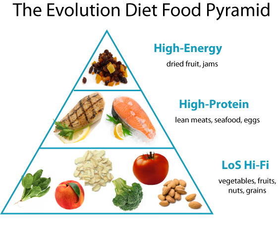
We don’t usually subscribe to the gimmicky tricks of many fad diets or even the USDA, for that matter, but since people are often visual learners, we decided to produce a diagram of what The Evolution Diet might look like.Here it is in all its glory:

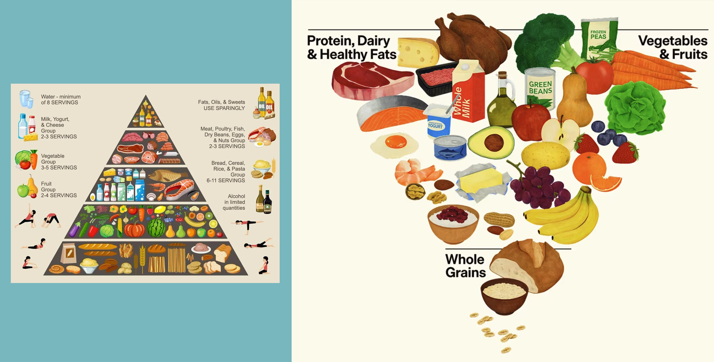
It’s important to contrast this with the old USDA food pyramid, which consisted of varying degrees of processed foods at the base that would make anyone in Big Ag happy:

That whole government-sponsored bottom row was condensed into a small portion in the bottom row in the LoS Hi-Fi section of The Evolution Diet pyramid. And the cookies and chips region was completely removed (come on, you can do better than that!).
It’s important to note that the USDA has gotten rid of the food pyramid altogether, however. They’ve replaced it with the myPlate which looks like:

That, unfortunately runs contrary to one of the central tenants of The Evolution Diet, which is to appropriate one’s food in the manner of our evolutionary ancestors: separating the food groups based on natural eating habits.
For more great tips on living naturally, check out:
![]() The Evolution Diet: All-Natural and Allergy Free
The Evolution Diet: All-Natural and Allergy Free